House Renovation - Dining Room
We really liked our original dining room, so generally we kept the overall look the same, with some minor changes. We had very few demands of the building crew, but one was that on "penalty-of-death", they were not to destroy the built-in china hutch that was already there. Other than that portion of the room, the old plaster walls were pulled down and the new drywall put up.
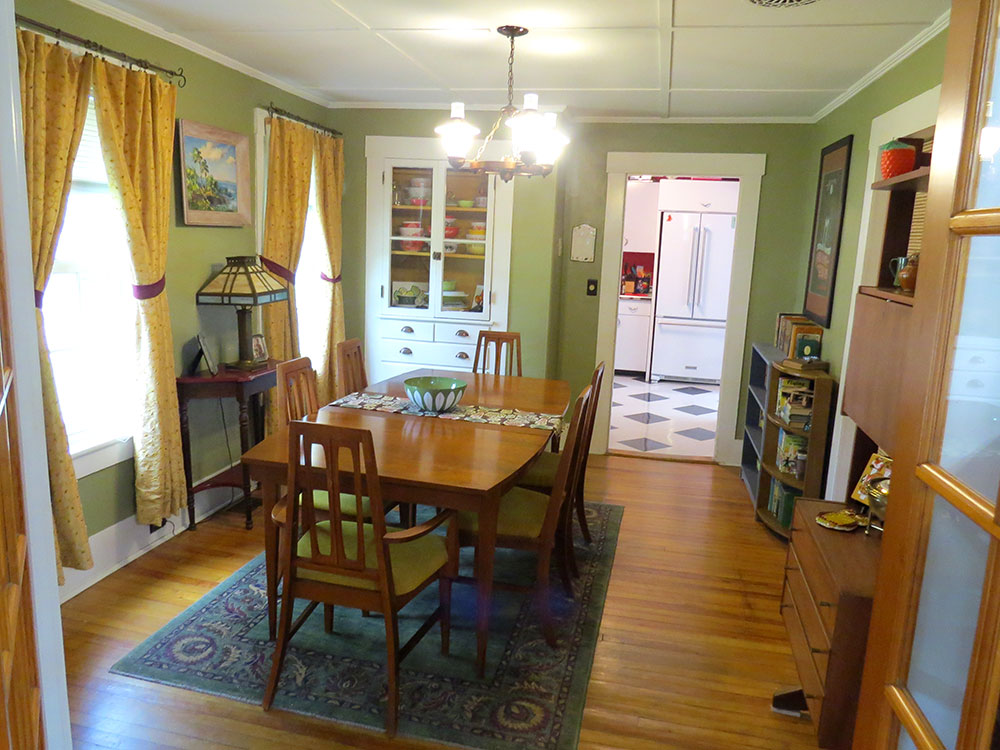
Our original dining room, which admittedly doesn't look that different from the final version.
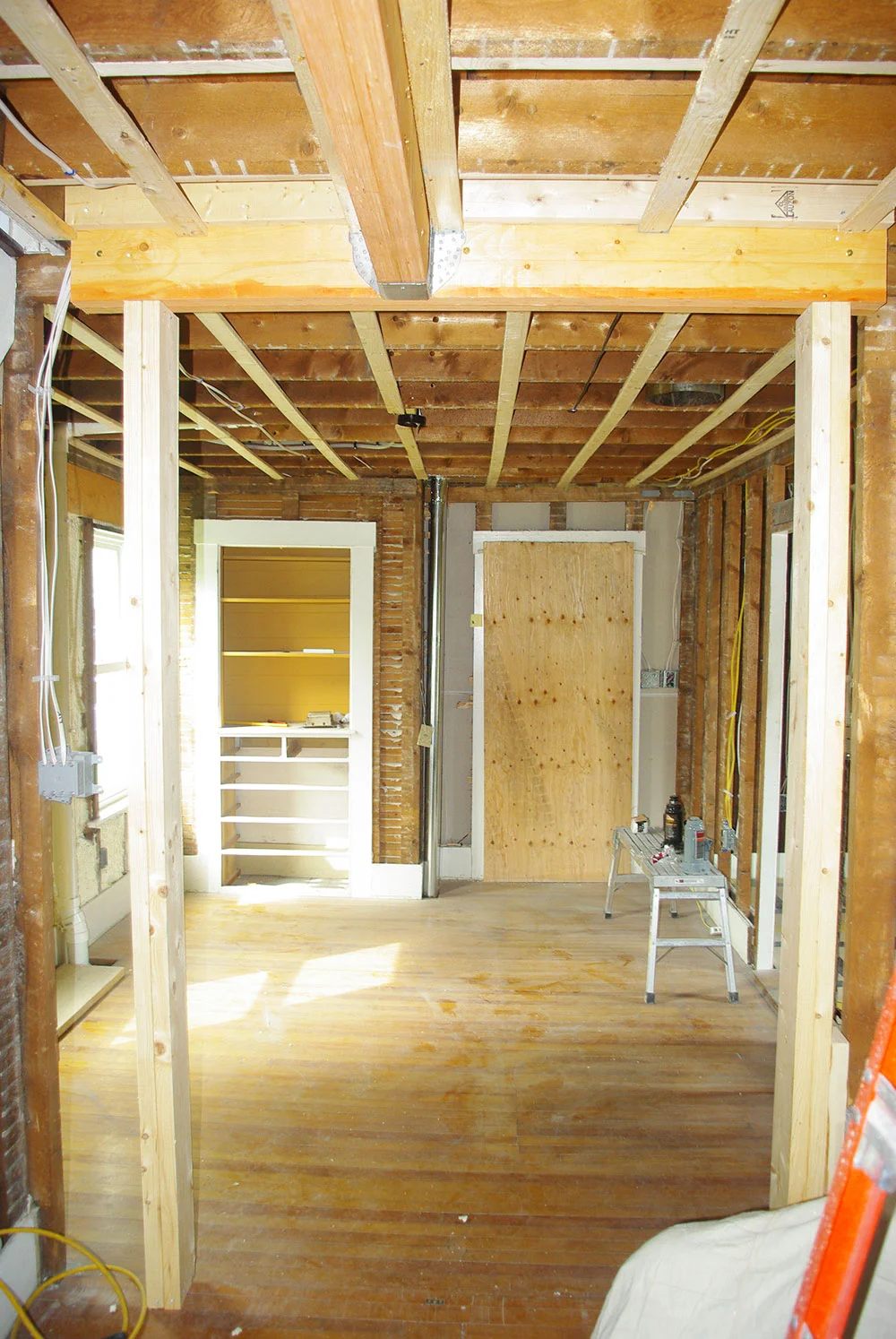
Dining room demolition in progress. We made sure the original china hutch was left intact. The plywood was added to the doorway to keep debris from the livable portion of the house.
Previously, there was a set of french doors that separated the dining room and library. These were nice to look at, but weren't really necessary and made the walls on either side of the opening too small to place any furniture. To fix this, we had the doors removed and the opening narrowed. It's still fairly wide, but now we can position furniture next to the doorway without it overlapping the opening.
The original doorway to the library with the French doors. The doors were eventually donated as we had no use for them.
The new doorway framed in.
The final, smaller opening to the library. Although narrower, the doorway is a bit taller than the original.
The plumbing for the new bathroom needed to run down the wall of the dining room. To accommodate this, a chase was built, leaving a bump-out between the windows. To make this look less like a growth and more of a feature, we had custom display shelves built to wrap around the chase. These shelves were made with maple to match the beam and built-in shelves in the library. The only issue we have is that since the chase is uninsulated, the water running through the pipes can be quite loud when the upstairs bathroom is used. Overall, though, we love having a place to display our mid-century designer-y things and think it looks great.
Plumbing from the new bathroom.
The framed in chase, with brackets for the shelves.
The final built-in shelving displaying some of our mid-century items.
One of the main features of the dining room is the new sliding door for the office. In the old dining room, there was no door to the office and no way to hide the elliptical machine and computers that were in there. Not the most pleasant things to look at while eating dinner. We wanted the ability close off the office and at first thought about installing a pocket door. This would have required rebuilding the wall and making the dining room a bit smaller. Since we couldn't afford to lose any space in the room, we opted for a sliding door instead. Most of the sliding door hardware we've seen was either a really barnly black cast-iron look or chrome, neither of which worked with the overall look we were going for. After scouring the internet, I finally found a Canadian company called 1925 Workbench that makes beautiful brushed brass hardware that was perfect. The door proved to be a bigger problem. Initially, the plan was to use old barn board that we already had from our house and build a custom door. However, it was discovered that there wasn't enough to build the door, so we had to scramble to find an alternative door. Most sliding doors look too much like they belong in a barn, so instead found a more mid-century looking door that worked perfectly. It took a while for the door to arrive and get installed, but once it was finally done we were very happy with the way it turned out. The door came unfinished, so it was stained with Zar Stain "Natural Teak", which perfectly matched the furniture in the room.
Our original dining room, with a bamboo screen we used to close off the office.
The new sliding office door now hides the contents of the office perfectly.
The sliding door opened.
When we first moved into our house, the room had a 1960s wagon wheel chandelier, which I initially hated and really wanted to replace. A few years ago, while antiquing in North Carolina, we found a very cool mod green and white chandelier. After some research, we discovered that it was a "Fun Lite", manufactured by Lightcraft in 1972. Over time, we came to appreciate and even like the kitschiness of the wagon wheel chandelier, but we love the way the new light looks in the room. Fear not, we didn't throw away "wagon wheel" and are thinking of ways we can use it somewhere.
The original 1960s wagon wheel chandelier.
Our "new" 1972 Fun Lite.
We love the way it looks with the rest of the room.
I've decorated the room with avocado green, harvest gold and splashes of orange. The wall color of the room is very close the the original color, but I wanted it a bit less khaki. After spending weeks agonizing over the exact shade and trying out swatches, I finally settled "Mountain Lane" by Benjamin Moore. It was a slightly brighter green than before that didn't clash with the green of the chandelier and worked well with the green countertops of our kitchen. As an accent, I had the inside of the china hutch painted in "Craftsman Gold" by California Paints. I made drapes for the windows out of vintage fabric I had been hoarding for a few years and they match the look of the room perfectly. The room has been furnished with mid-century pieces found at various antique shops in New Hampshire.
The finished dining room, looking towards the library.
The dining room looking towards the kitchen.
There is nothing more tragic or wasteful, in our opinion, than having things sit and look pretty, but never get used. So, with that philosophy in mind, we have been trying to eat dinner at our dining room table most nights. This way the room is getting used and enjoyed and isn't just a place for special occasions.
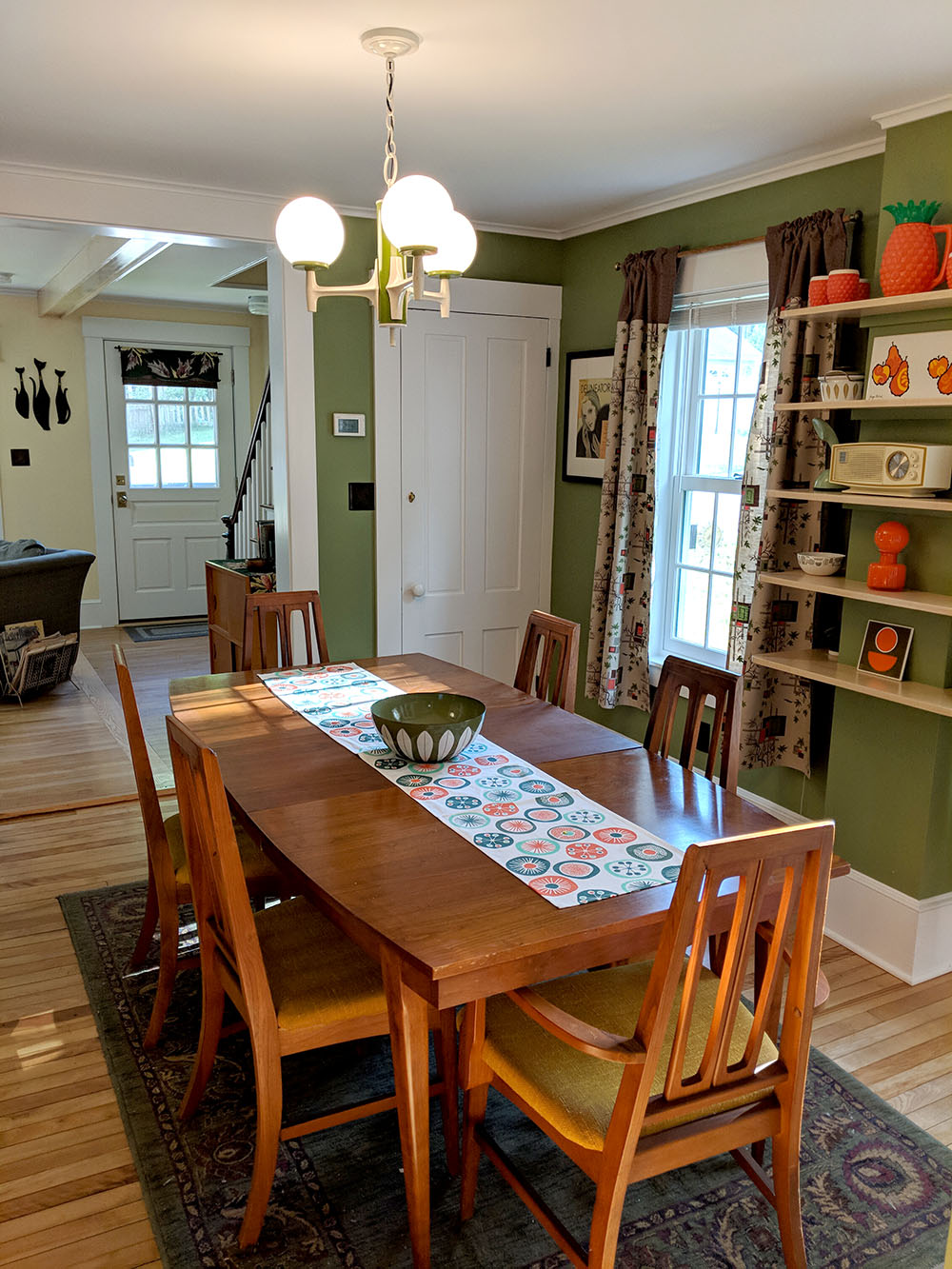
Our final dining room and vintage mid-century table and chairs found at "Just L" in Littleton, NH.
Even though I initially scoffed at the idea, I'm quite happy with the early 70s look of the room and I think Carol Brady would be impressed.
"The Brady Bunch" dining room turned out to be an accidental inspiration for our dining room
The "Bewitched" dining room also has some familiar colors and a very similar dining room set.


